Clipping Box-Shadow
Feb 18, 2010I've been redesigning the company website for the past couple months and have found myself taking a liking to the box-shadow CSS3 property. With the imminent release of Opera 10.5, Internet Explorer will be the only mainstream browser that doesn't support the property in any form.
By definition, IE will just ignore the property, so adding it will give users of other browsers a richer experience, while not harming the experience of IE users.
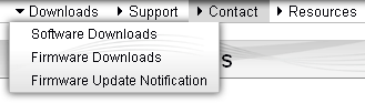
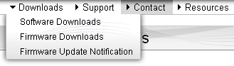
I was happily adding box-shadow to all sorts of elements (tastefully of course!) until I got to the drop-down menu system. Putting the effect there made the menus stand out nicely with respect to the page content beneath, however, the shadow poked above the top of the element and extended into the horizontal menu. This ruined the illusion that the vertical menus were attached to the horizontal menu, and instead appeared to be floating above the entire page.
box-shadow:0px 0px 10px #333333;
-moz-box-shadow:0px 0px 10px #333333;
-webkit-box-shadow:0px 0px 10px #333333;
What I wanted to do was to remove the top part of the shadow, or slide it under the horizontal menu. My first thought was using z-index, giving the whole horizontal menu a higher z-index than the vertical menus. However the vertical menus are themselves children of elements in the horizontal menu, so no-go there. Then I thought of giving each <a> element in the horizontal menu a z-index of 10, and all of the vertical menus a z-index of 5. This should ensure the links themselves appear above the box-shadow.
Immediately there was a problem, because when not highlighted, the horizontal links have a transparent background. Only when they are selected are they given a darker background, as you can see in the animated image above. The Contact link has a repeating background image that serves as the highlight and thus covers the box-shadow there. The transparent background on the other items in the horizontal menu let the box-shadow show through, despite being positioned with a higher z-index.
So why not make the shadow along the top a box-shadow as well? I do this because the shadow there is a background image and part of the visual design; it needs to work in IE as well. I could have also created another repeating background image for the non-highlighted menu items but that seemed hackish (I still don't like the fact that I need to use a background image even for the highlighted items). And still, neither of those solutions would have solved the problem that would appear at either end of the horizontal menu where the links ended, but the vertical menu, and thus the box-shadow, might still extend. There had to be a more elegant way to just... clip-off the entire top of the box-shadow.
... 
That's when the answer hit me: try using the much-maligned and arcane CSS clip property. I discovered that using clip not only affects the visible area of the element, but also box effects such as box-shadow; and it works in all browsers that support box-shadow. Way cool. All I needed to do was apply a clip value that snipped the top off the box-shadow, while leaving the rest of the box-shadow intact.
CSS clip works in a really odd way (I definitely recommend checking out the preceding link!). It accepts four length values, which must be in absolute units. Percentages won't fly here, so unless you know the exact pixel dimensions of your box, you'll only be able to clip the shadow reliably off of the top and left sides. Fortunately, this is precisely what I needed to do. It also only works on absolutely or fixed positioned elements, which fortunately the vertical menus are.
clip:rect(0px, 1000px, 1000px, -10px);
The 0px clips the top of the menu right down to the top edge, which hides the box-shadow. Yay! Since the menus can be of arbitrary width and height depending on their contents, the two 1000px values make sure that the right and bottom sides are definitely not clipped at all (did you follow that link I posted earlier on? eh?). Finally, the -10px value pulls the left clipping border 10 pixels away from the left border so that the shadow can show through. JFYI, specifying a last value of 0px would have hidden the border along the left-hand side as well.
So, when z-index just won't work to hide parts of your box-shadows, you can always cut off your box-shadows using clip to get just the effect you need.
| ⇐ Hidden-state input elements and defaultValue | Help change HTML5 for the better ⇒ |
