Graphing the NHL 2010-2011 playoff race in HTML5 canvas
Apr 7, 2011Here's a little HTML5 web application which uses the <canvas> element to help visualise this season's 2010-2011 NHL playoff race. the hardest part was actually finding the data to use. The actual canvas implementation only took an hour or so to framework, and a couple hours more to tweak and flesh out.
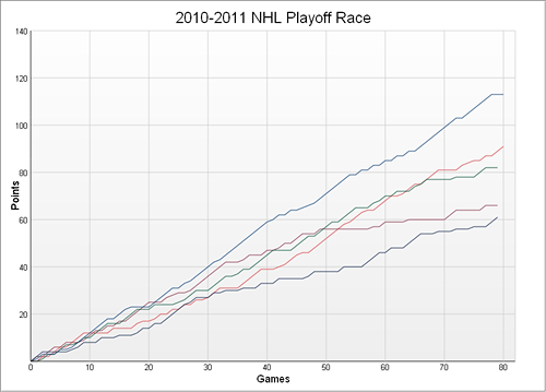
Here's the race in the Pacific division:
You can dynamically select which team lines to show, as well as groups of lines based on division or conference. The X-axis can also be switched between game-by-game progression, and day-by-day. Showing the day-by-day chart allows you to see how the Christmas break and the All-Star break affected point progression during the season.
You can spot some interesting trends using this tool. For instance, the race in the Northwest has been wide open, while that in the Pacific has been unbelievably tight all season long. Ottawa hit a slump between the 40 and 55 game mark but have been pretty consistent both before and after. The New Jersey implosion and second-half comeback is also visible in dramatic detail. It's a shame they fell short of the playoffs; it would have made a great story. Too bad Hollywood has no idea what hockey is. ![]()
I'll be updating the data daily until the end of this season and probably leaving it after that. If I can find a good way to automate things, I might start it up again next season. This tool won't work in Internet Explorer 8 or earlier, sorry. (I'm actually not sorry at all)
Check it out here: 2010-2011 NHL Playoff Race - HTML5 Graphing with Canvas
| ⇐ Consistent, cross-browser legend positioning within fieldsets | CSS3 transitions using visibility and delay ⇒ |